6.6. Creating plots with Altair and the Vega-Lite specification
 This is one of the 100+ free recipes of the IPython Cookbook, Second Edition, by Cyrille Rossant, a guide to numerical computing and data science in the Jupyter Notebook. The ebook and printed book are available for purchase at Packt Publishing.
▶ Text on GitHub with a CC-BY-NC-ND license
▶ Code on GitHub with a MIT license
▶ Go to Chapter 6 : Data Visualization
▶ Get the Jupyter notebook
Vega is a declarative format for designing static and interactive visualizations. It provides a JSON-based visualization grammar that focuses on the what instead of the how. Vega-Lite is a higher-level specification that is easier to use than Vega, and that compiles directly to Vega.
Altair is a Python library that provides a simple API to define and display Vega-Lite visualizations. It works in the Jupyter Notebook, JupyterLab, and nteract.
Altair is under active development and some details of the API might change in future versions.
Getting started...
Install Altair with conda install -c conda-forge altair.
How to do it...
1. Let's import Altair:
import altair as alt
2. Altair provides several example datasets:
alt.list_datasets()
['airports',
 ...
 'driving',
 'flare',
 'flights-10k',
 'flights-20k',
 'flights-2k',
 'flights-3m',
 'flights-5k',
 'flights-airport',
 'gapminder',
 ...
 'wheat',
 'world-110m']
3. We load the flights-5k dataset:
df = alt.load_dataset('flights-5k')
The load_dataset() function returns a pandas DataFrame.
df.head(3)
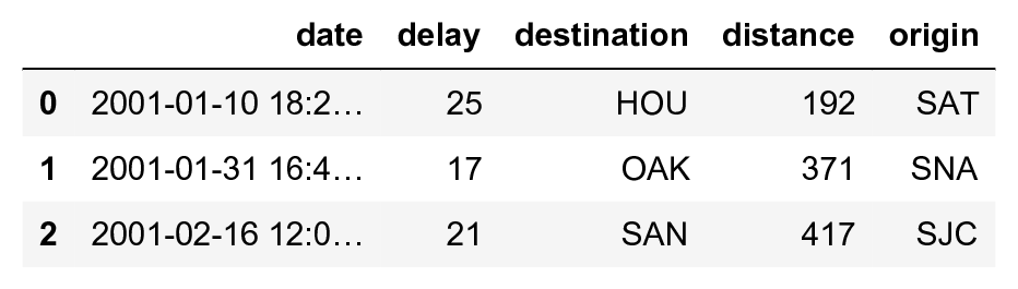
This dataset provides the date, origin, destination, flight distance, and delay of many flights.
4. Let's create a scatter plot showing the delay as a function of the date, with the marker size depending on the flight distance:
alt.Chart(df).mark_point().encode(
    x='date',
    y='delay',
    size='distance',
)
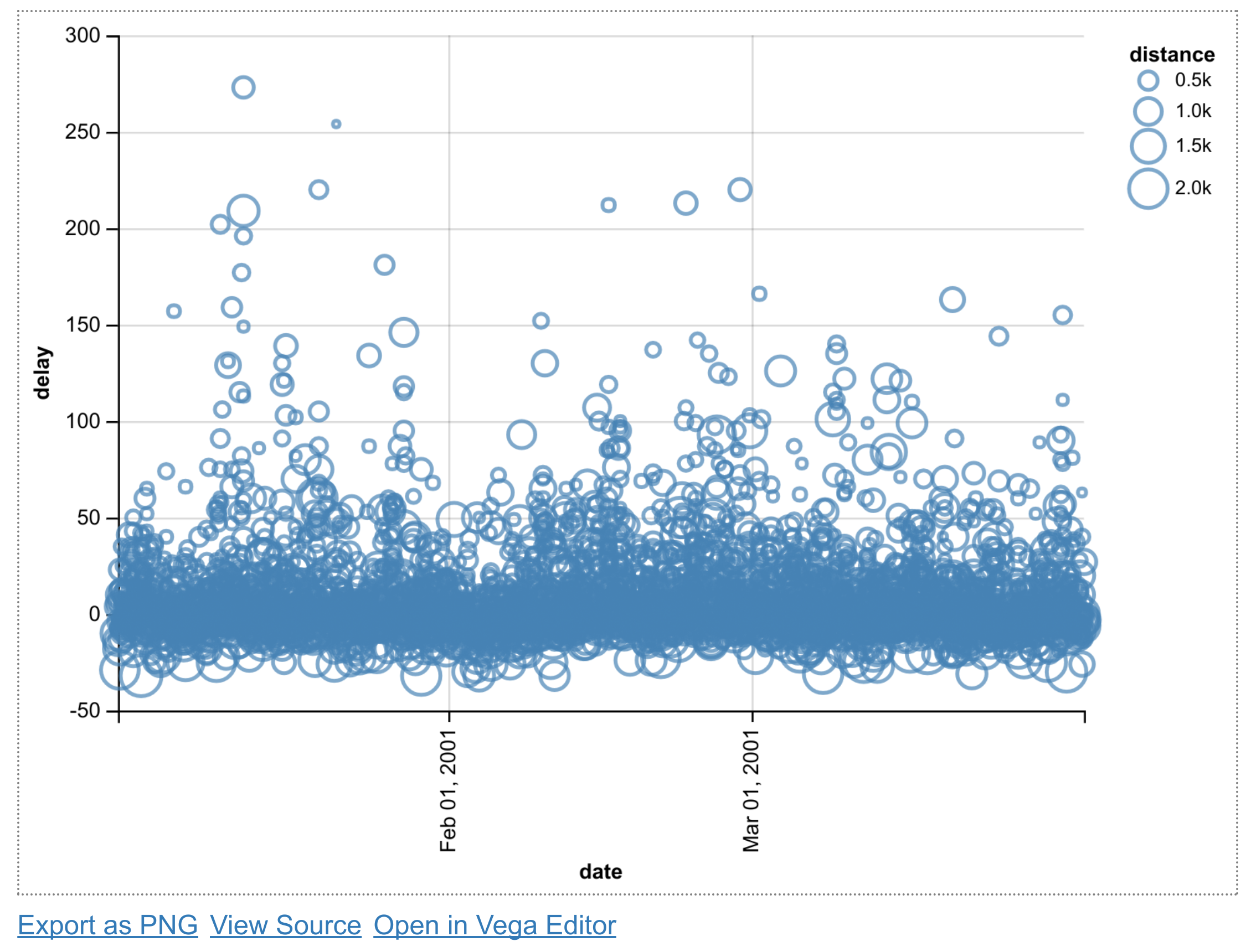
The mark_point() method specifies that we're creating a scatter plot. The encode() function allows us to link parameters of the plot (x and y coordinates, the point size) to specific columns in our DataFrame.
5. Next, we create a bar plot with the average delay of all flights departing from Los Angeles, as a function of time:
df_la = df[df['origin'] == 'LAX']

x = alt.X('date', bin=True)
y = 'average(delay)'

alt.Chart(df_la).mark_bar().encode(
    x=x,
    y=y,
)
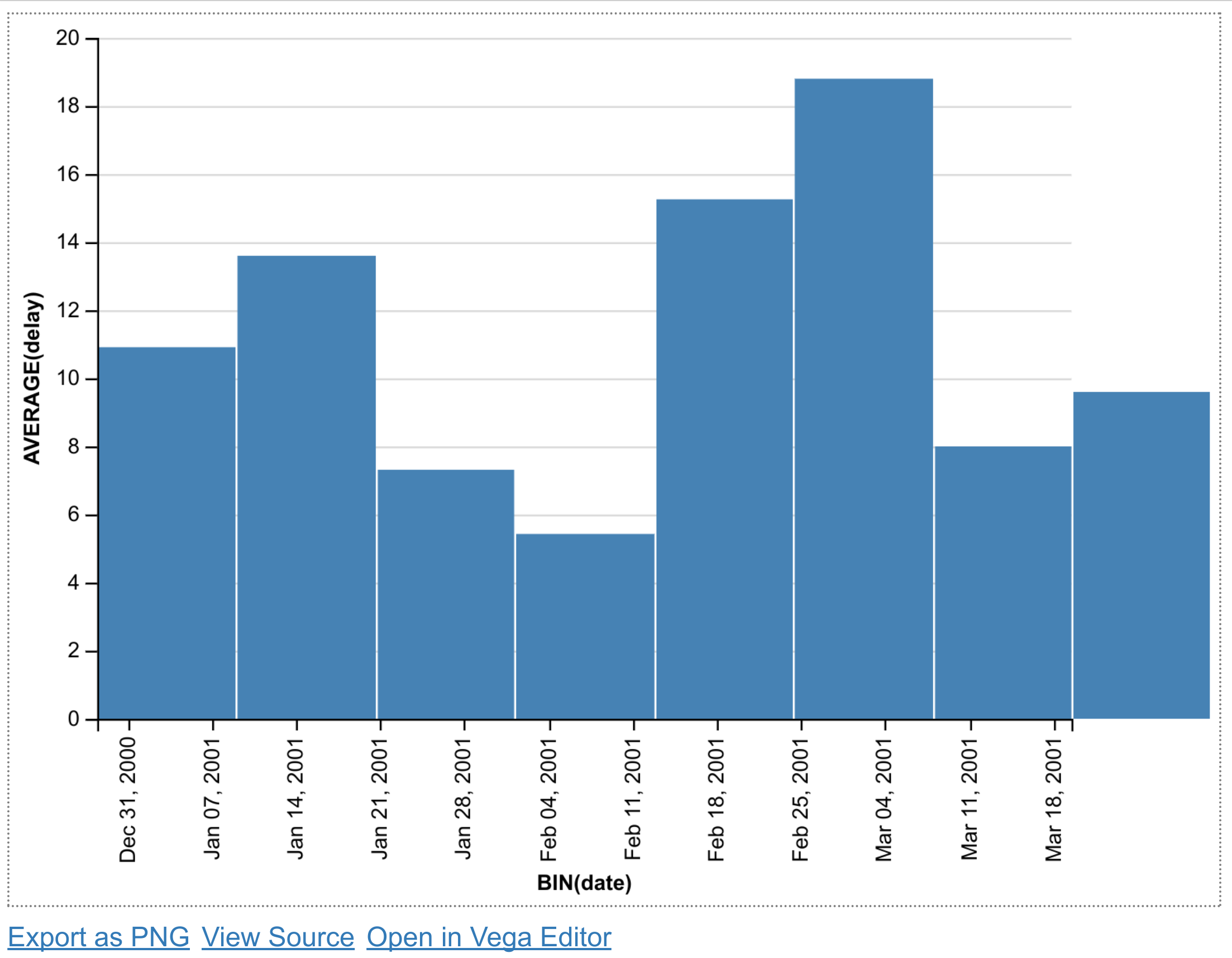
We select all flights departing from the LAX airport using pandas. For the x coordinate, we use the alt.X class to specify that we want a histogram (bin=True). For the y coordinate, we specify the average of all delays for every bin.
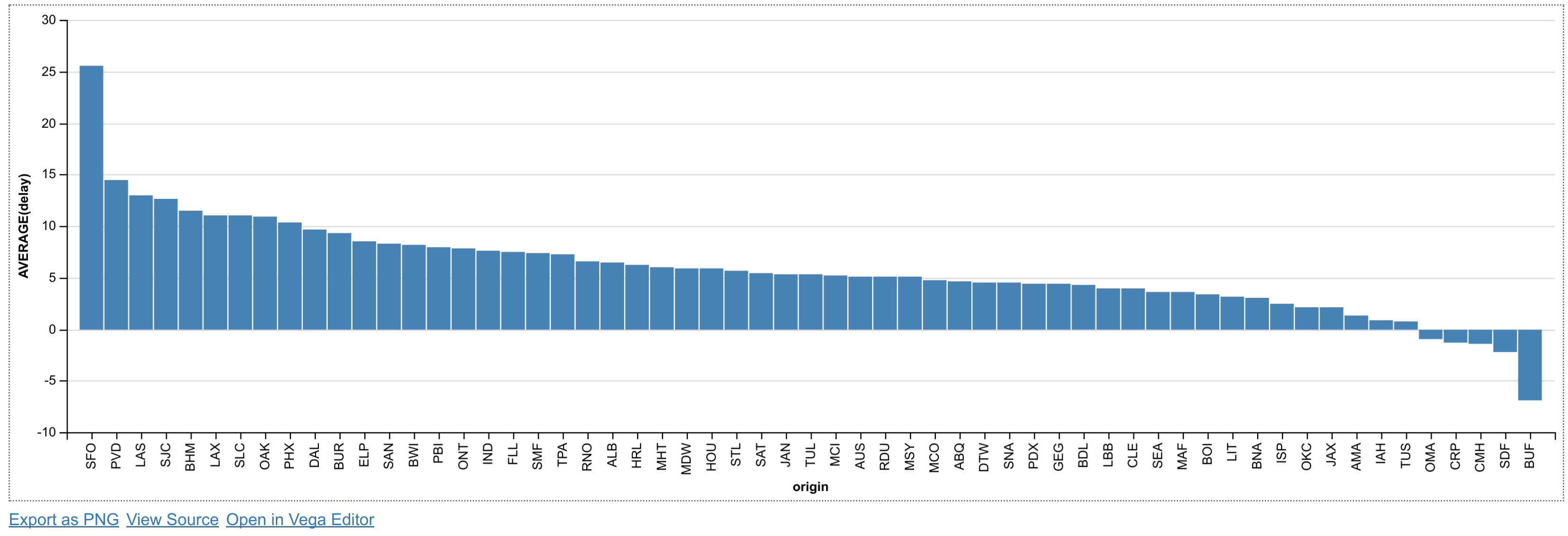
6. Now, we create a histogram of the average delay of every origin airport. We use the sort option of the X class to specify that we want to order the x axis (origin) as a function of the average delay, in descending order:
sort_delay = alt.SortField(
    'delay', op='average', order='descending')

x = alt.X('origin', sort=sort_delay)
y = 'average(delay)'

alt.Chart(df).mark_bar().encode(
    x=x,
    y=y,
)
How it works...
Altair provides a Python API to generate a Vega-Lite specification in JSON. The to_json() method of an Altair chart can be used to inspect the JSON created by Altair. For example, here is the JSON of the last chart example above:
{
 "$schema": "https://vega.github.io/schema/vega-lite/v1.2.1.json",
 "data": {
  "values": [
   {
    "date": "2001-01-10 18:20:00",
    "delay": 25,
    "destination": "HOU",
    "distance": 192,
    "origin": "SAT"
   },
   ...
  ]
 },
 "encoding": {
  "x": {
   "field": "origin",
   "sort": {
    "field": "delay",
    "op": "average",
    "order": "descending"
   },
   "type": "nominal"
  },
  "y": {
   "aggregate": "average",
   "field": "delay",
   "type": "quantitative"
  }
 },
 "mark": "bar"
}
The JSON may contain the data itself, like here, or a URL to a data file. It also defines the encoding channels which link the chart parameters to the data.
In the Jupyter Notebook, Altair leverages the Vega-Lite library to create a Canvas or SVG figure with the requested plot.
There's more...
Altair and Vega-Lite support much more complex charts, as can be seen in the galleries of these projects.
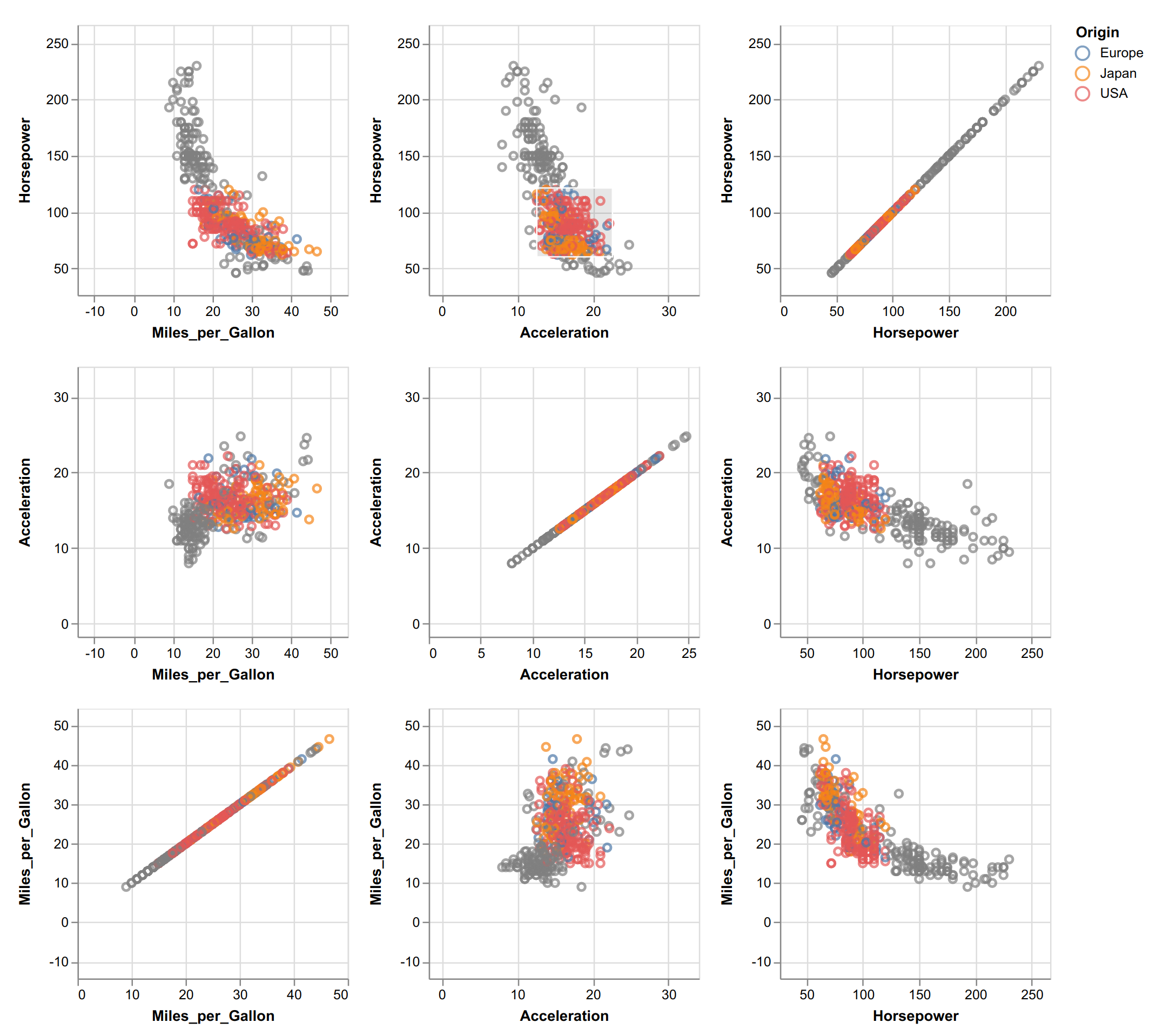
Vega-Lite supports interactive plots. The following example from the Vega-Lite gallery illustrates linked brushing between subplots, where a rectangular selection can be drawn with the mouse in any subplot:
There is also an online editor on the Vega-Lite website that can be used to create plots directly in the browser without installing anything.
Here are a few references:
- Altair documentation at https://altair-viz.github.io/
- Altair gallery at https://altair-viz.github.io/gallery/index.html
- Vega-Lite documentation at https://vega.github.io/vega-lite/
- Vega-Lite gallery at https://vega.github.io/vega-lite/examples/
- Vega-Lite online editor at https://vega.github.io/editor/#/custom/vega-lite
See also
- Creating statistical plots easily with seaborn
- Discovering interactive visualization libraries in the Notebook