6.2. Creating statistical plots easily with seaborn
 This is one of the 100+ free recipes of the IPython Cookbook, Second Edition, by Cyrille Rossant, a guide to numerical computing and data science in the Jupyter Notebook. The ebook and printed book are available for purchase at Packt Publishing.
▶ Text on GitHub with a CC-BY-NC-ND license
▶ Code on GitHub with a MIT license
▶ Go to Chapter 6 : Data Visualization
▶ Get the Jupyter notebook
seaborn is a library that builds on top of matplotlib and pandas to provide easy-to-use statistical plotting routines. In this recipe, we give a few examples of the types of statistical plots that can be created with seaborn.
How to do it...
1. Let's import NumPy, matplotlib, and seaborn:
import numpy as np
from scipy import stats
import matplotlib.pyplot as plt
import seaborn as sns
%matplotlib inline
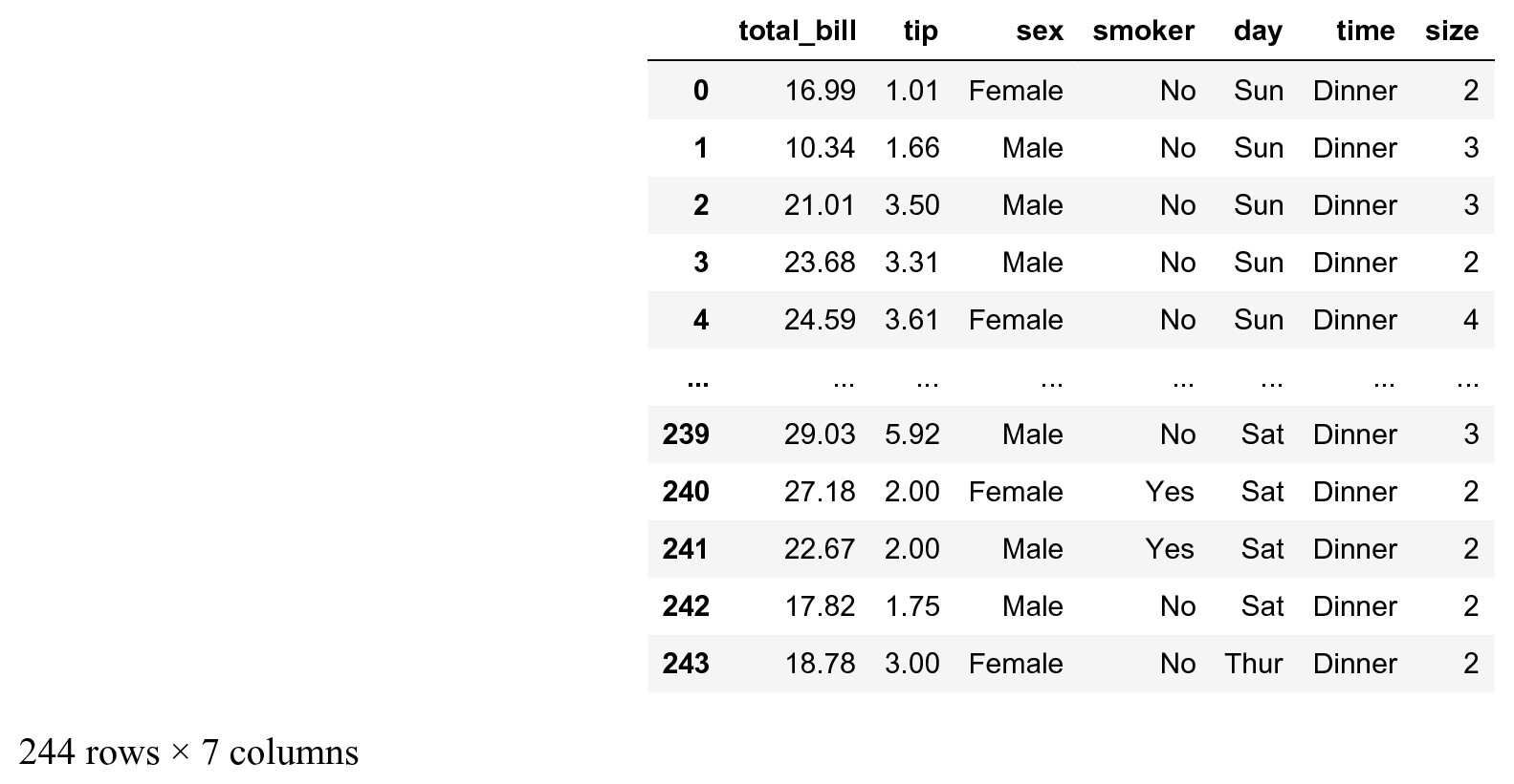
2. seaborn comes with builtin datasets, which are useful when making demos. The tips datasets contains the bills and tips of taxi trips:
tips = sns.load_dataset('tips')
tips
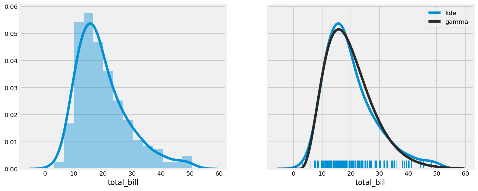
3. seaborn implements easy-to-use functions to visualize the distribution of datasets. Here, we plot the histogram, kernel density estimation (KDE), and a gamma distribution fit of our dataset:
# We create two subplots sharing the same y axis.
f, (ax1, ax2) = plt.subplots(1, 2,
                       figsize=(12, 5),
                       sharey=True)

# Left subplot.
# Histogram and KDE (active by default).
sns.distplot(tips.total_bill,
             ax=ax1,
             hist=True)

# Right subplot.
# "Rugplot", KDE, and gamma fit.
sns.distplot(tips.total_bill,
             ax=ax2,
             hist=False,
             kde=True,
             rug=True,
             fit=stats.gamma,
             fit_kws=dict(label='gamma'),
             kde_kws=dict(label='kde'))
ax2.legend()
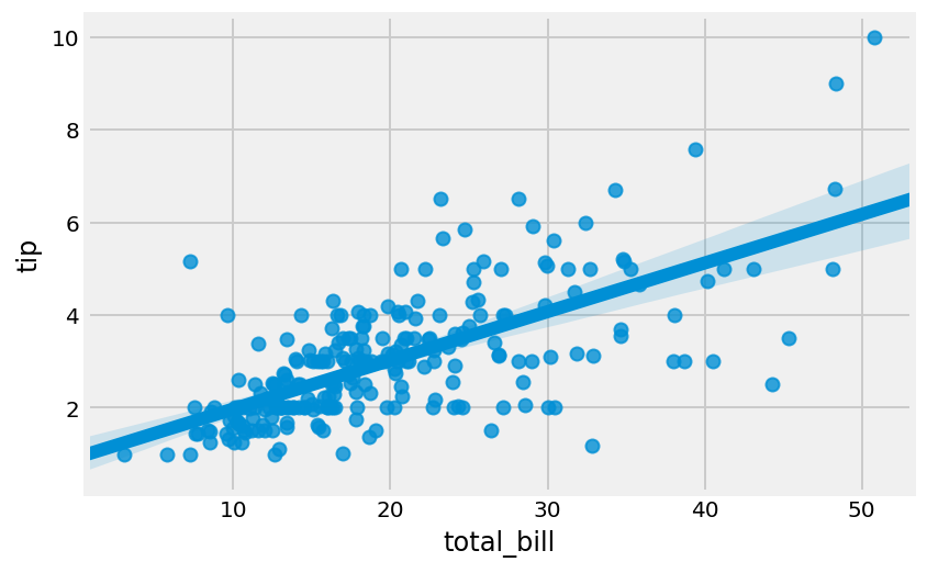
4. We can make a quick linear regression to visualize the correlation between two variables:
sns.regplot(x="total_bill", y="tip", data=tips)
5. We can also visualize the distribution of categorical data with different types of plots. Here, we display a bar plot, a violin plot, and a swarmplot, which show an increasing amount of details:
f, (ax1, ax2, ax3) = plt.subplots(
    1, 3, figsize=(12, 4), sharey=True)
sns.barplot(x='sex', y='tip', data=tips, ax=ax1)
sns.violinplot(x='sex', y='tip', data=tips, ax=ax2)
sns.swarmplot(x='sex', y='tip', data=tips, ax=ax3)
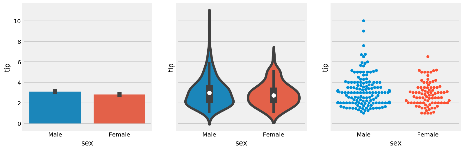
The bar plot shows the mean and standard deviation of the tip, for males and females. The violin plot shows an estimation of the distribution in a more informative way than the bar plot, especially with non-Gaussian or multimodal distributions. The swarm plot displays all points, using the x axis to make them non-overlapping.
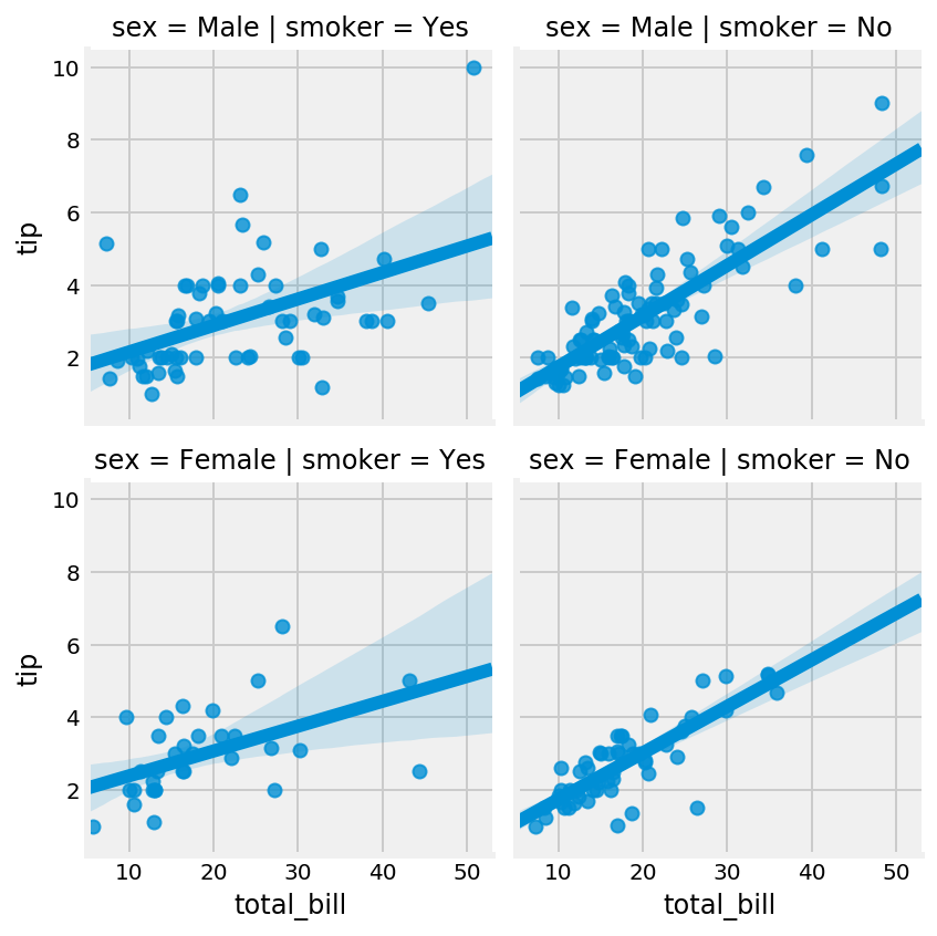
6. The FacetGrid lets us explore a multidimensional dataset with several subplots organized within a grid. Here, we plot the tip as a function of the bill with a linear regression, for every combination of smoker (Yes/No) and sex (Male/Female):
g = sns.FacetGrid(tips, col='smoker', row='sex')
g.map(sns.regplot, 'total_bill', 'tip')
There's more...
Besides seaborn, there are other high-level plotting interfaces:
- The Grammar of Graphics is a book by Dr. Leland Wilkinson that has influenced many high-level plotting interfaces such as R's ggplot2, Python's ggplot by ŷhat, and others.
- Vega, by Trifacta, is a declarative visualization grammar that can be translated to D3.js (a JavaScript visualization library). Altair provides a Python API for the Vega-Lite specification (a higher-level specification that compiles to Vega).
Here are some more references:
- seaborn tutorial at https://seaborn.pydata.org/tutorial.html
- seaborn gallery at https://seaborn.pydata.org/examples/index.html
- Altair available at https://altair-viz.github.io
- plotnine, a Grammar of Graphics implementation in Python, at https://plotnine.readthedocs.io/en/stable/
- ggplot for Python available at http://ggplot.yhathq.com/
- ggplot2 for the R programming language, available at http://ggplot2.org/
- Python Plotting for Exploratory Data Analysis at http://pythonplot.com/
See also
- Using matplotlib styles
- Discovering interactive visualization libraries in the Notebook
- Creating plots with Altair and the Vega-Lite specification